
Goals
- Create a clear, trustworthy digital presence that reflects Back 40’s mission and tone.
- Establish visual identity grounded in themes of discovery, support, and nature.
- Present a small number of grantees in a respectful and emotionally resonant way.
- Build a website that feels handcrafted, non-institutional, and non-performative.
- Ensure long-term usability and content flexibility as the foundation grows.
Discovery & direction
Our earliest meetings revealed that Back 40 isn’t just a funder—it’s a quiet ally for youth programs often overlooked by traditional philanthropy. The team wanted the design to reflect this ethos: no big claims, no glossy hero images. Just alignment, care, and invitation.
We explored visual metaphors like portals, maps, field journals, and handcrafted scrapbooks. The name itself—Back 40—carries rural and historical resonance, which led to concepts inspired by topo lines, land plots, and trail markers. Three early directions were tested:
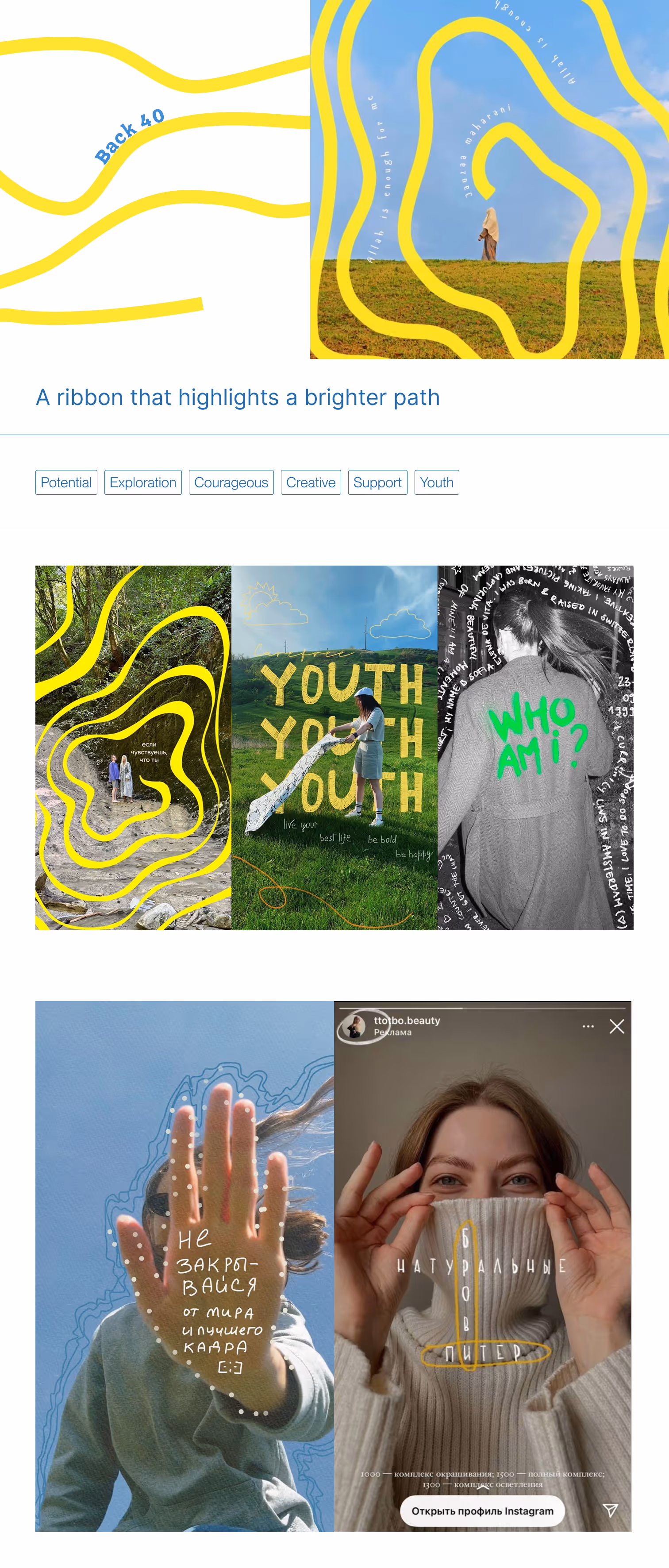
- Ribbon: bright and graphic, emphasizing boldness and visibility.
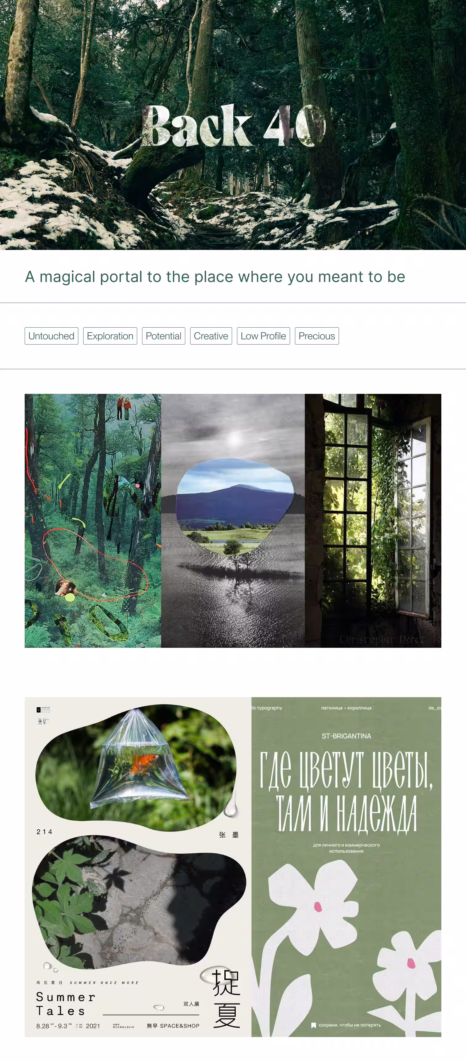
- Magical Portal: organic and layered, using visual metaphors of discovery and growth.
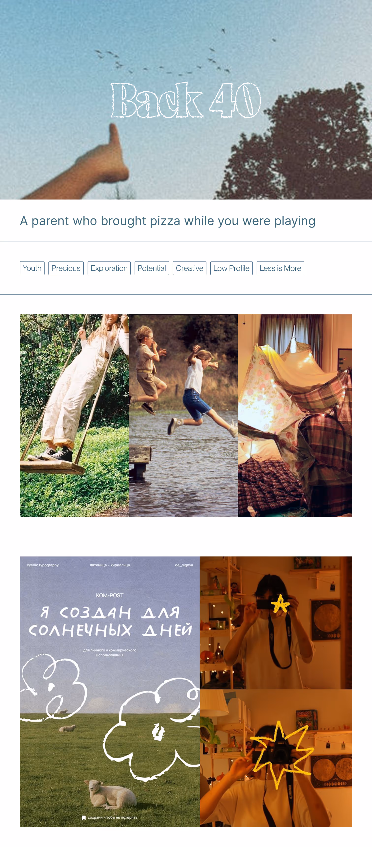
- Surprise: warm and nostalgic, with retro cues and emotional tone.
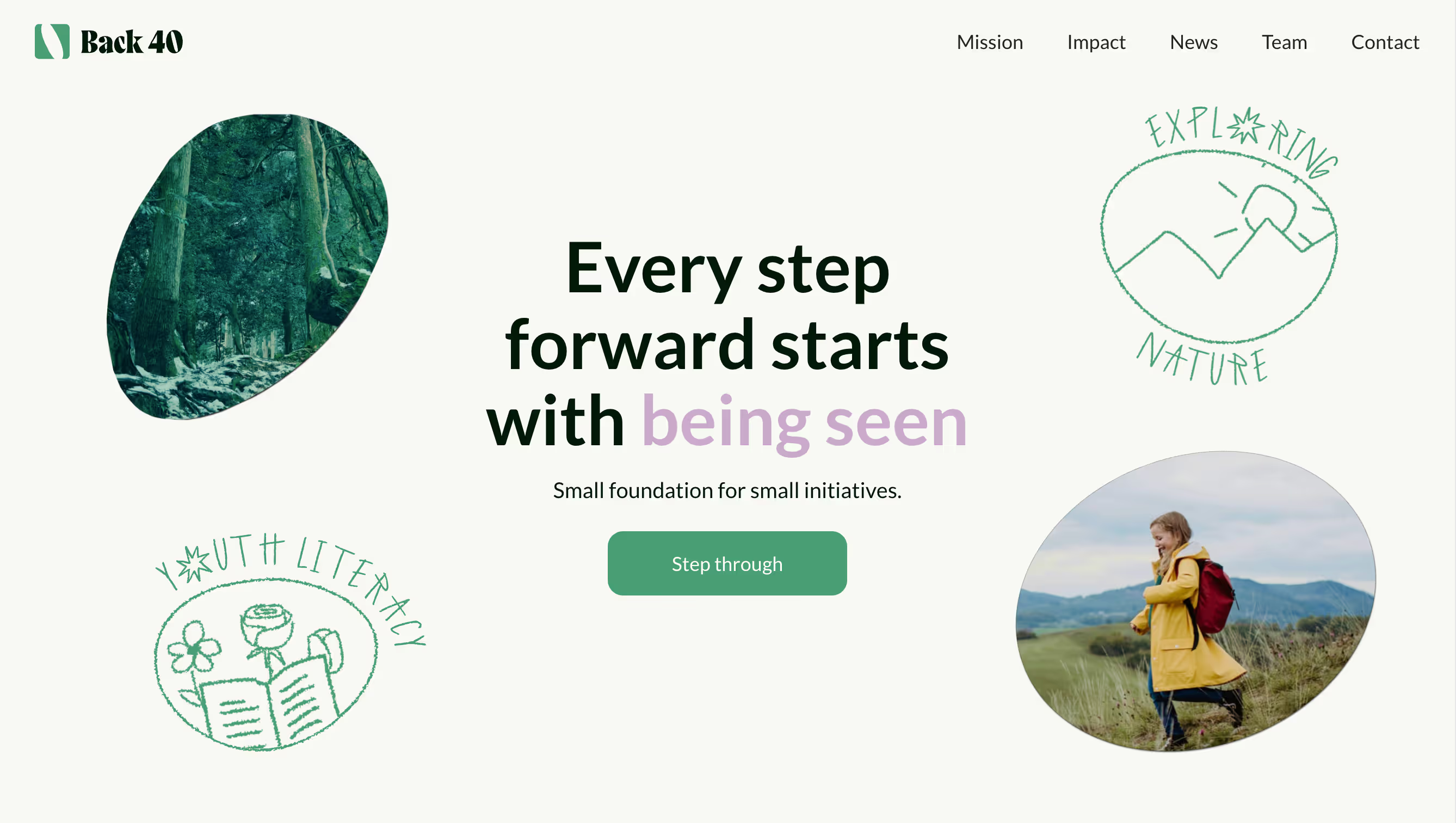
The chosen direction blended Magical Portal with hand-touched details and gentle typography. It became the foundation for both the visual identity and web layout. The final design language for Back 40 centers around the idea of quiet discovery — where even small support can open unexpected worlds. Circular and organic portal shapes cut through imagery like windows into overlooked stories, echoing the foundation’s mission to uplift under-the-radar youth work.
The color palette is rooted in forest greens and soft neutrals, with lilac accents offering surprise and warmth. Typography balances approachability (Lato) with presence (Gregory Poster), reflecting a tone that is calm, confident, and quietly bold. This direction makes Back 40 feel like what it is: a small foundation doing meaningful work off the main trail.
Brand & Visual Identity
Two logo directions were created to reflect Back 40’s values from different angles. Both are minimal, adaptable, and designed to carry the brand across print and digital, while expressing Back 40’s balance of warmth and depth.
- The first uses a simple plus-like mark — soft, human, and supportive. It signals quiet care and small additions that matter.

- The second is a portal-inspired shape — more structured and symbolic of discovery. It evokes movement, and transformation.
The second approach was chosen because it directly reflects the idea of a portal — a quiet passage toward discovery, growth, and new possibilities.
Web Design
The portal idea comes to life on the site through a scrolling animation that gradually expands the portal shape:
Development & Integration
- Webflow front-end fully responsive and scalable.
- Portal-shaped image masks built into CMS fields.
- GSAP and Webflow animations.
- Performance optimizations for low-bandwidth rural areas
Impact
Back 40 now has a digital presence that mirrors its values: quiet, intentional, and full of belief in small beginnings. The site is already being used to share with potential partners and grantees. It creates trust without flash, clarity without excess.
- First-ever public site for the foundation.
- Seamless design/dev process from concept to launch.
- Fully editable by team with no coding required.
Team & collaborators

Will White — Founding Trustee.
Emily L. White — Founding Trustee.

Slava Fedosenko — project lead across web-design, visual direction, and development.
Alyona Belyakova — design partner on visual explorations and conceptual framing.